Microsoft Microsoft Certifications PL-300 Questions & Answers
Question 291:
HOTSPOT
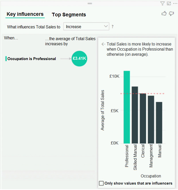
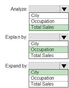
You have a table that contains the following three columns:
1.
City
2.
Total Sales
3.
Occupation
You need to create a key influencers visualization as shown in the exhibit. (Click the Exhibit tab.)
How should you configure the visualization? To answer, select the appropriate options in the answer area.
NOTE: Each correct selection is worth one point.
Hot Area:
Correct Answer:
Box 1: Total Sales Box 2: Occupation Box 3: City You can use Expand By to add fields you want to use for setting the level of the analysis without looking for new influencers. Reference:
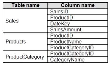
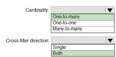
You are creating a Microsoft Power BI data model that has the tables shown in the following table.
The Products table is related to the ProductCategory table through the ProductCategoryID column.
You need to ensure that you can analyze sales by product category.
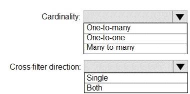
How should you configure the relationships from Products to ProductCategory? To answer, select the appropriate options in the answer area. NOTE: Each correct selection is worth one point.
Hot Area:
Correct Answer:
Box 1: One-to-many
Box 2: Both
For One-to-many relationships, the cross filter direction is always from the "one" side, and optionally from the "many" side (bi-directional).
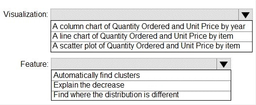
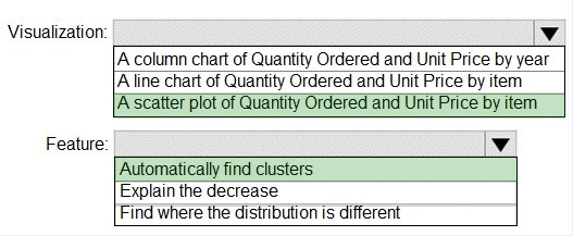
You have a dataset named Pens that contains the following columns:
1.
Unit Price
2.
Quantity Ordered
You need to create a visualization that shows the relationship between Unit Price and Quantity Ordered. The solution must highlight orders that have a similar unit price and ordered quantity.
Which type of visualization and which feature should you use? To answer, select the appropriate options in the answer area.
NOTE: Each correct selection is worth one point.
Hot Area:
Correct Answer:
Box 1: A scatter plot...
A scatter chart always has two value axes to show: one set of numerical data along a horizontal axis and another set of numerical values along a vertical axis. The chart displays points at the intersection of an x and y numerical value,
combining these values into single data points. Power BI may distribute these data points evenly or unevenly across the horizontal axis. It depends on the data the chart represents.
Box 2: Automatically find clusters
Scatter charts are a great choice to show patterns in large sets of data, for example by showing linear or non-linear trends, clusters, and outliers.
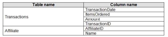
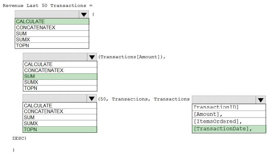
Your company has affiliates who help the company acquire customers.
You build a report for the affiliate managers at the company to assist them in understanding affiliate performance.
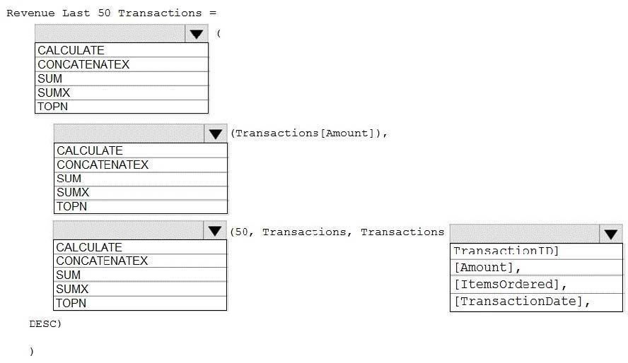
The managers request a visual showing the total sales value of the latest 50 transactions for each affiliate. You have a data model that contains the following tables.
You need to develop a measure to support the visual.
How should you complete the DAX expression? To answer, select the appropriate options in the answer area.
NOTE: Each correct selection is worth one point.
Hot Area:
Correct Answer:
Box 1: CALCULATE
Start with CALCULATE and use a SUMX.
CALCULATE evaluates an expression in a modified filter context.
Box 2: SUM
Box 3: TOPN
TOPN returns the top N rows of the specified table.
Box 4: [TransactionDate]
TOPN Syntax: TOPN(,
, , [[, , []]...])
The orderBy_expression: Any DAX expression where the result value is used to sort the table and it is evaluated for each row of table.
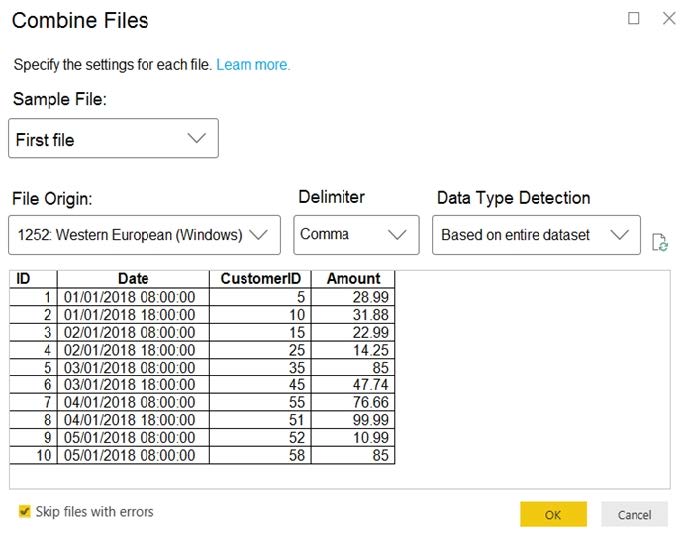
You have a folder of monthly transaction extracts.
You plan to create a report to analyze the transaction data.
You receive the following email message: “Hi, I’ve put 24 files of monthly transaction data onto the shared drive. File Transactions201801.csv through Transaction201812.csv have four columns while files Transactions201901.csv through
Transaction201912.csv have the same four columns plus an additional three columns. Each file contains 10 to 50 transactions.”
You get data from the folder and select Combine and Load. The Combine Files dialog box is shown in the exhibit. (Click the Exhibit tab.)
For each of the following statements, select Yes if the statement is true. Otherwise, select No.
NOTE: Each correct selection is worth one point.
Hot Area:
Correct Answer:
Box 1: Yes
The four columns used in the 2018 transactions are already displayed.
Box 2: Yes
The columns used are based on the entire dataset. The additional columns in the 2019 files will be detected.
Box 3: Yes
Note: Under the hoods, Power BI will automatically detect which delimiter to use, and may even promote the first row as headers. You can manually change the delimiter, or define how Power BI should handle data types. You can set it to
automatically detect data types based on first 200 rows, or the entire dataset or you can even opt out the detection of data types.
Question 296:
HOTSPOT
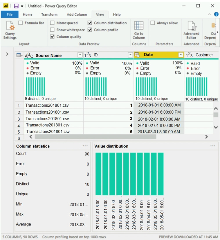
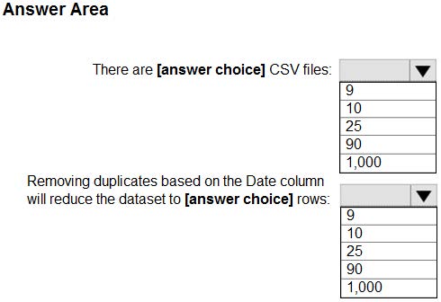
You view a query named Transactions as shown in the following exhibit.
The query gets CSV files from a folder.
Use the drop-down menus to select the answer choice that completes each statement based on the information presented in the graphic.
NOTE: Each correct selection is worth one point.
Hot Area:
Correct Answer:
Box 1: 9
9 distinct CSV files.
Box 2: 10
10 distinct dates.
Question 297:
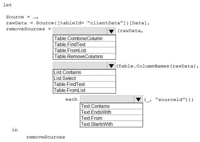
HOTSPOT
You have an API that returns more than 100 columns. The following is a sample of column names.
1.
client_notified_timestamp
2.
client_notified_source
3.
client_notified_sourceid
4.
client_notified_value
5.
client_responded_timestamp
6.
client_responded_source
7.
client_responded_sourceid
8.
client_responded_value
You plan to include only a subset of the returned columns. You need to remove any columns that have a suffix of sourceid.
How should you complete the Power Query M code? To answer, select the appropriate options in the answer area.
NOTE: Each correct selection is worth one point.
Hot Area:
Correct Answer:
Box 1: Table.RemoveColumns When you do "Remove Columns" Power Query uses the Table.RemoveColumns function
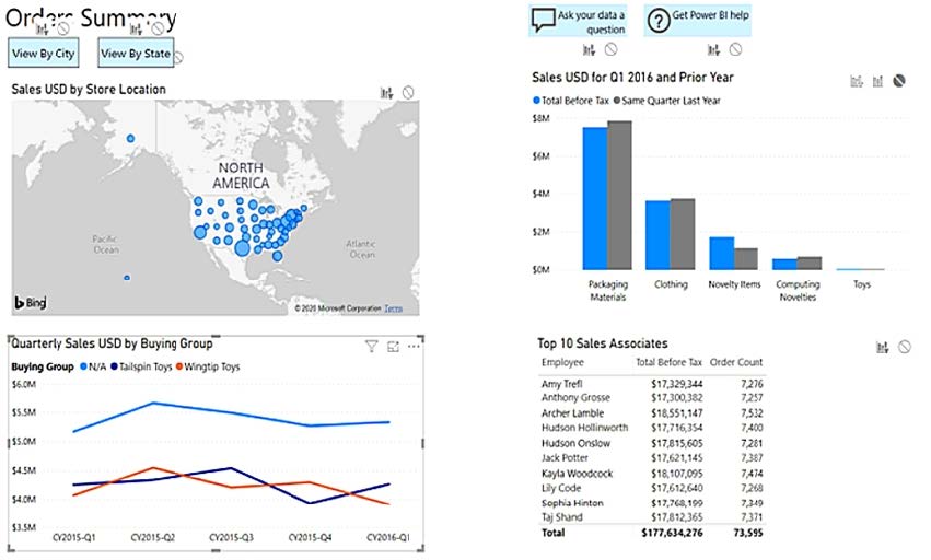
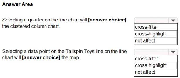
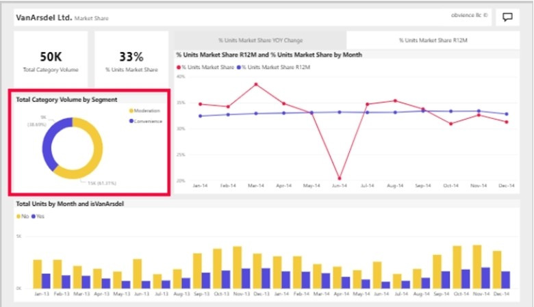
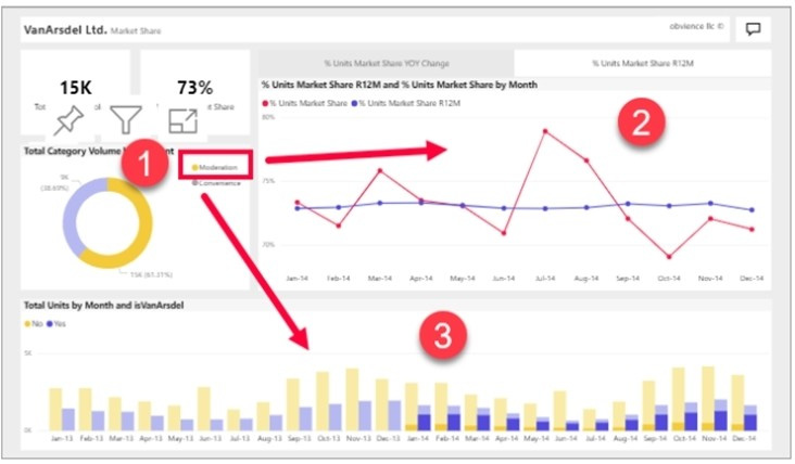
You have a report page that contains the visuals shown in the following exhibit.
Use the drop-down menus to select the answer choice that completes each statement based on the information presented in the graphic.
NOTE: Each correct selection is worth one point.
Hot Area:
Correct Answer:
Box 1: cross-filter
By default, selecting a data point in one visual on a report page will cross-filter or cross- highlight the other visuals on the page.
Box 2: cross-highlight
Example:
By default, selecting a data point in one visual on a report page will cross-filter or cross- highlight the other visuals on the page.
1.
Let's see what happens when we select Moderation.
2.
Cross-filtering removes data that doesn't apply. Selecting Moderation in the doughnut chart cross-filters the line chart. The line chart now only displays data points for the Moderation segment.
3.
Cross-highlighting retains all the original data points but dims the portion that does not apply to your selection. Selecting Moderation in the doughnut chart cross-highlights the column chart. The column chart dims all the data that applies to the Convenience segment and highlights all the data that applies to the Moderation segment.
Question 299:
HOTSPOT
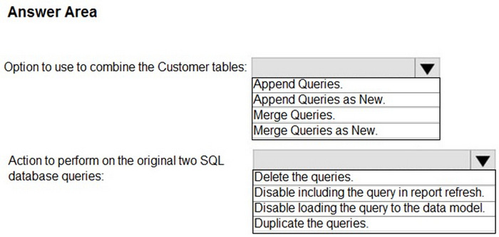
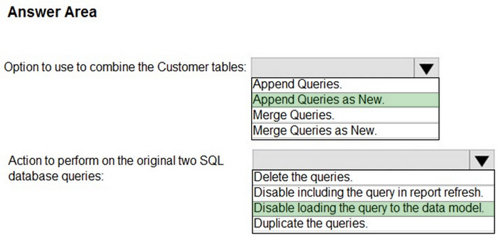
You have two Azure SQL databases that contain the same tables and columns.
For each database, you create a query that retrieves data from a table named Customer.
You need to determine the Customer tables into a single table. The solution must minimize the size of the data model and support scheduled refresh in powerbi.com.
What should you do? To answer, select the appropriate options in the answer area.
NOTE: Each correct selection is worth one point.
Hot Area:
Correct Answer:
Box 1: Append Queries as New.
There are two primary ways of combining queries: merging and appending.
1.
When you have one or more columns that you’d like to add to another query, you merge the queries.
2.
When you have additional rows of data that you’d like to add to an existing query, you append the query.
Box 2: Disable loading the query to the data model
For every query that loads into model memory will be consumed. and Memory is our asset in the Model, less memory consumption leads to better performance in most of the cases. The best approach is to disable loading.
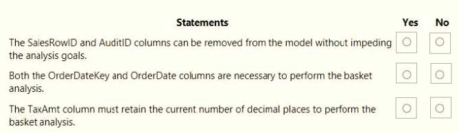
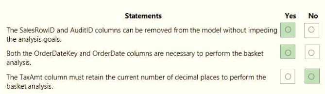
You are creating a Microsoft Power Bl imported data model to perform basket analysis. The goal of the analysis is to identify which products are usually bought together in the same transaction across and within sales territories. You import a fact table named Sales as shown in the exhibit. (Click the Exhibit tab.)
The related dimension tables are imported into the model. Sales contains the data shown in the following table.
Nowadays, the certification exams become more and more important and required by more and more enterprises when applying for a job. But how to prepare for the exam effectively? How to prepare for the exam in a short time with less efforts? How to get a ideal result and how to find the most reliable resources? Here on Vcedump.com, you will find all the answers. Vcedump.com provide not only Microsoft exam questions, answers and explanations but also complete assistance on your exam preparation and certification application. If you are confused on your PL-300 exam preparations and Microsoft certification application, do not hesitate to visit our Vcedump.com to find your solutions here.