True or False: It is not possible to blend axes for multiple measures into a single axis
A. False
B. True
Correct Answer: A
We can very much blend multiple measures into a single axis. Such charts are called Combined-Axis / Blended-Axis charts. Follow along:
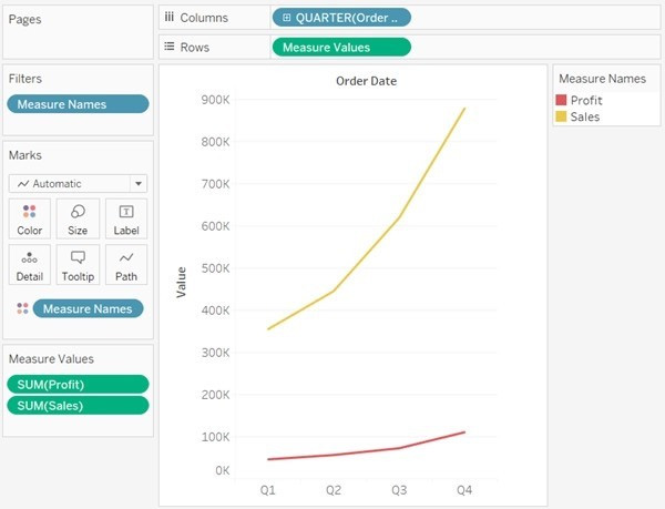
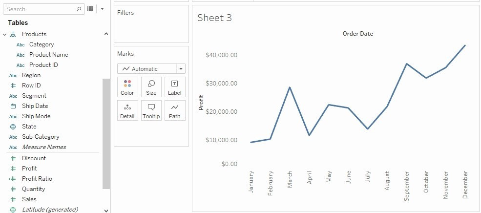
Measures can share a single axis so that all the marks are shown in a single pane. To blend multiple measures, drag one measure or axis and drop it onto an existing axis.
Instead of adding rows and columns to the view, when you blend measures there is a single row or column and all of the values for each measure is shown along one continuous axis. For example, the view below shows quarterly sales and
profit on a shared axis.
Note: If you drag a measure on to the canvas and only see a single ruler indicator instead of the double ruler indicator shown below, Tableau creates dual axes instead of a blended axis. For more information about how to create dual axes, see Compare two measures using dual axes.
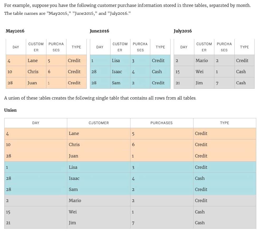
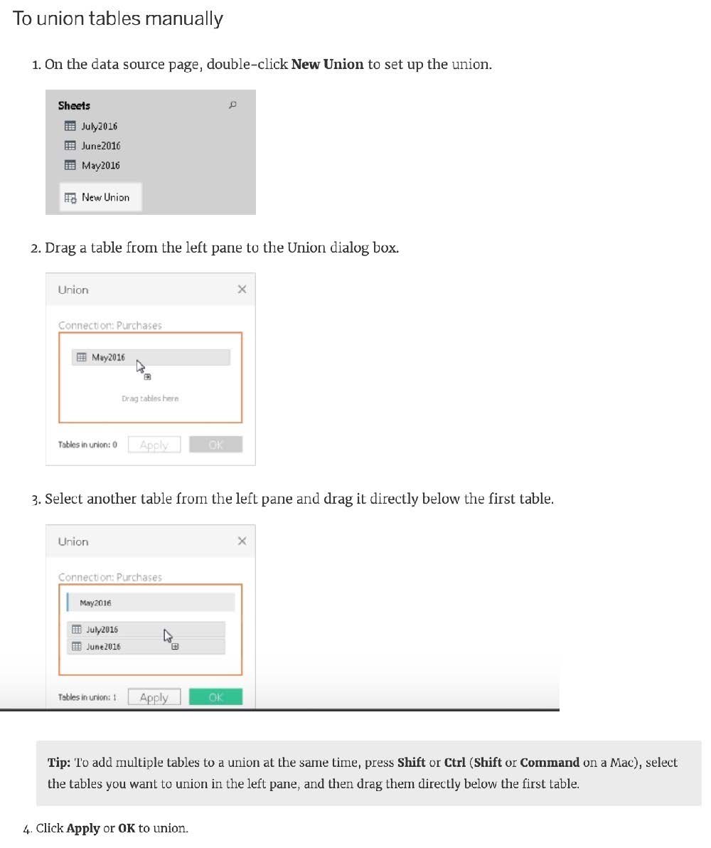
You can union your data to combine two or more tables by appending values (ROWS) from one table to another. To union your data in Tableau data source, the tables must come from the same connection.
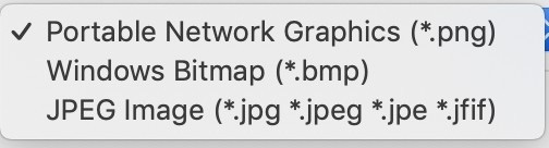
When exporting a worksheet as an image in Tableau, which of the following file formats are available?
A. Portable Network Graphic (.PNG)
B. JPEG Image (.JPG, .JPEG)
C. Tagged Image File Format (TIFF)
D. Windows Bitmap (.BMP)
Correct Answer: ABD
The following options are available when an image is Exported:
NOTE: When we Copy an image rather than exporting it, then the image is copied to the clipboard in the TIFF file format! However, it is not available when EXPORTING an image. Reference: https://help.tableau.com/current/pro/desktop/enus/save_export_image.htm
Question 164:
What is the one most important thing you should do after creating a Dual-axis chart?
A. Synchronise the axis
B. Change the colours
C. Edit the labels
D. Hide the axis
Correct Answer: A
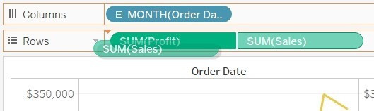
After creating a dual axis chart, make sure to synchronise their axis since they both might not be having the same y-axis.
To align the two axes in a dual axes chart to use the same scale, right-click (control-click on Mac) the secondary axis, and select Synchronize Axis. This aligns the scale of the secondary axis to the scale of the primary axis. In this example, the Sales axis is the secondary axis and the Profit axis is the primary axis. If you would like to change which axis is the primary, and which axis is the secondary, select the field on the Columns or Rows shelf that is the secondary, and drag it in front of the primary field on the shelf until you see an orange triangle appear.
In this example, you can select the SUM(Sales) field on the Rows shelf, and drag it in front of the SUM(Profit) field. The Sales axis is now the primary and the Profit axis is the secondary.
By default, what does Tableau do when you connect to a data source?
A. Creates an extract of the data
B. Creates a live connection to the data
C. Loads your actual file into Tableau
D. Sorts the data in descending order
Correct Answer: B
Before you can build a view and analyze your data, you must first connect Tableau to your data. Tableau supports connecting to a wide variety of data, stored in a variety of places.
By default, when you connect a data source to Tableau, Tableau will create a live connection to the data.
Live connection refers to a data source that contains direct connection to underlying data, which provides real-time or near real-time data. With a live connection, Tableau makes queries directly against the database or other source, and
returns the results of the query for use in a workbook. Users can create live connections and then share them on Tableau Server so that other Tableau users can use the same data using the same connection and filtering settings.
Which of the following are valid ways to show Mark Labels in the visualisation?
A. Click on the Show mark labels icon in the Toolbar
B. Drag the measure to the Text label in the Marks Card
C. Click on Data in the Menu bar and Choose Show Mark Labels
D. Click on Analysis in the Menu bar and choose Show Mark Labels
Correct Answer: ABD
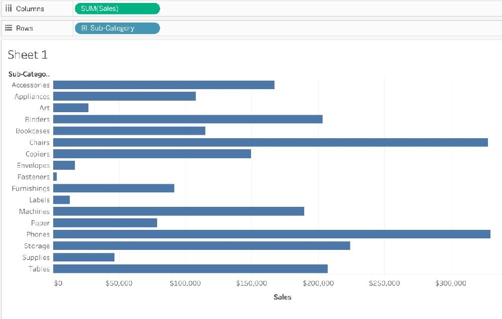
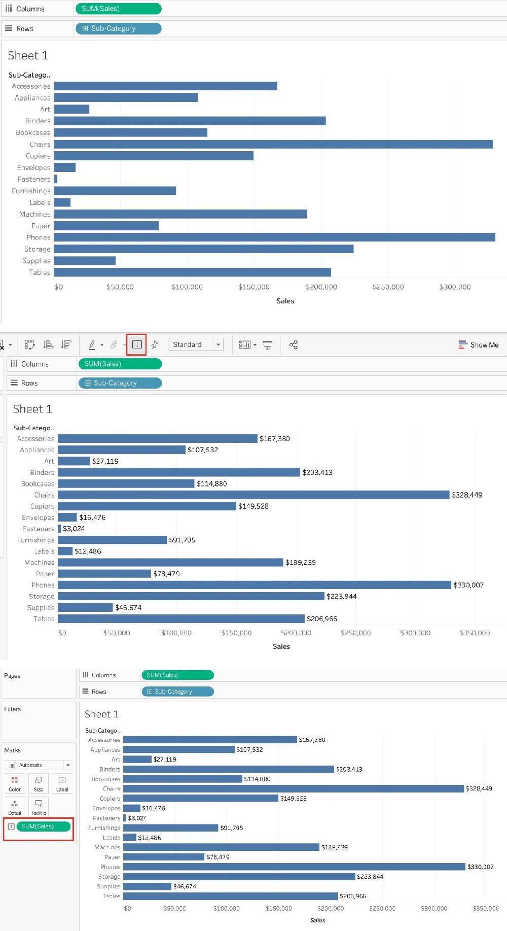
The following showcase how you can show mark labels. Using the Sample Superstore dataset: 1) Let's create a Bar chart showing the sales for each sub-category:
2) Now you can show labels by:
2.1) Click on Show Mark Labels Icon in the Toolbar ( easiest )
2.2) Drag Sales to the Text icon in the Marks Card 2.3) Click on Analysis-> Show mark labels from the Tableau menu bar
Question 167:
A Tableau Support case can be opened in which of the following valid ways?
A. Using the Developer Community Forum
B. Contacting Salesforce using their website
C. Using the support option on the Tableau website
D. Using the Tableau learn website
Correct Answer: C
It is possible to open a Tableau support case by visiting the following link : https://www.tableau.com/support/case
Question 168:
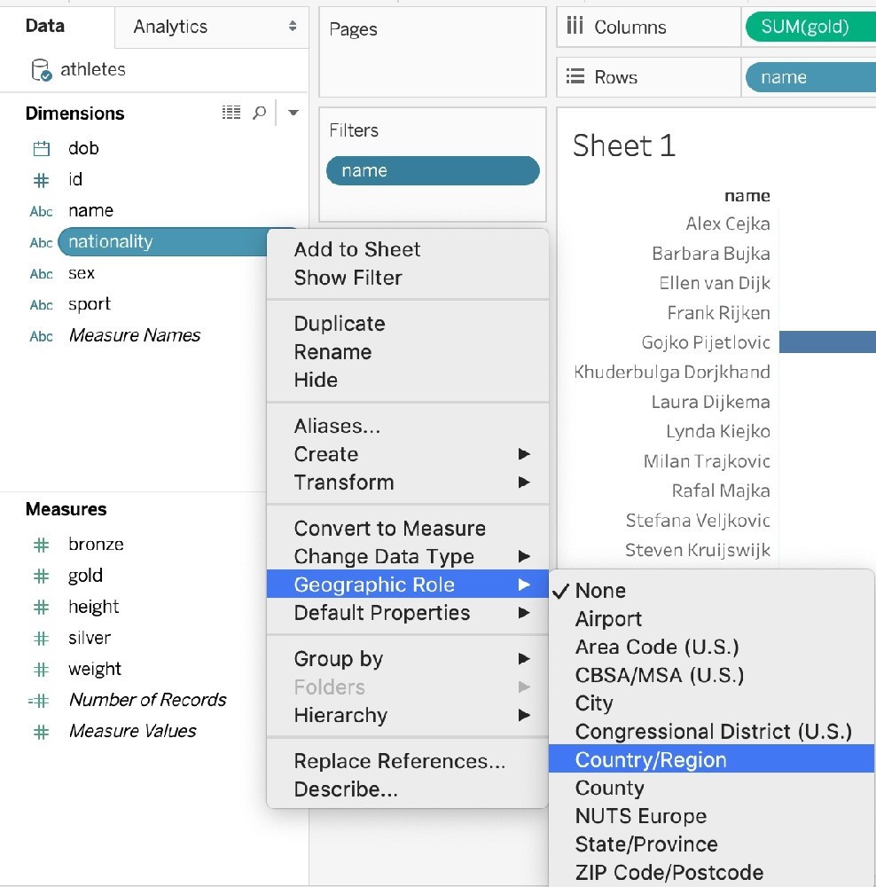
How can you MANUALLY assign geographic roles to a dimension from the data pane?
A. Edit the config file in My Documents-> MyTableauRepository for a quick fix
B. Right click it-> Geographic role-> and then assign the appropriate geographic role
C. Edit the data source manually for a quick resolution
D. Right click it-> Edit Default properties-> Assign geographic roles
Correct Answer: B
From the data pane, simply right click on the dimension, choose geographic role, and then select the appropriate role as follows:
Question 169:
Broadly speaking, when users connect to Tableau, the data fields in their data set are automatically assigned a ____________ and a ____________.
A. role, type
B. Data type, Value
C. type, role
D. dimension, measure
Correct Answer: A
When users connect to Tableau, the data fields in their data set are automatically assigned a role and a type. Role can be of the following two types: 1) Dimension 2) Measure Type can be of the following : 1) String 2) Number 3) Geographic 4) Boolean 5) Date 6) Date and Time
Question 170:
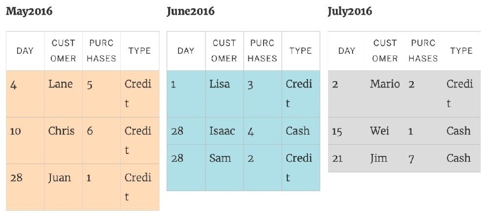
You can _______________ your data to combine two or more tables by appending values (rows) from one table to another
A. join
B. blend
C. concatenate
D. union
Correct Answer: D
You can union your data to combine two or more tables by appending values (rows) from one table to another. To union your data in Tableau data source, the tables must come from the same connection. For example, suppose you have the following customer purchase information stored in three tables, separated by month. The table names are "May2016," "June2016," and "July2016."
A union of these tables creates the following single table that contains all rows from all tables.
Nowadays, the certification exams become more and more important and required by more and more enterprises when applying for a job. But how to prepare for the exam effectively? How to prepare for the exam in a short time with less efforts? How to get a ideal result and how to find the most reliable resources? Here on Vcedump.com, you will find all the answers. Vcedump.com provide not only Tableau exam questions, answers and explanations but also complete assistance on your exam preparation and certification application. If you are confused on your TDS-C01 exam preparations and Tableau certification application, do not hesitate to visit our Vcedump.com to find your solutions here.